UX Design - Few examples
Here you will find few examples I made based on existing projects, UX samples, and a list of cognitive biases and principles to use when implementing UX strategies
POC & Study
Psychological principles in UX
Design Psychology Background - Cognitive biases and principles
| 1. | Hick’s Law | More options leads to harder decisions | Information |
| 2. | Confirmation Bias | People look for evidence that confirms what they think | Information |
| 3. | Priming | Previous stimuli influence users’ decision | Information |
| 4. | Cognitive Load | Total amount of mental effort that is required to complete a task | Information |
| 5. | Anchoring Bias | Users rely heavily on the first piece of information they see | Information |
| 6. | Nudge | Subtle hints can affect users’ decisions | Information |
| 7. | Progressive Disclosure | Users are less overwhelmed if they’re exposed to complex features later | Information |
| 8. | Fitts’s Law | Large and close elements are easier to interact with | Information |
| 9. | Attentional Bias | Users’ thoughts filter what they pay attention to | Information |
| 10. | Empathy Gap | People underestimate how much emotions influence user behaviors | Information |
| 11. | Visual Anchors | Elements used to guide users’ eyes | Information |
| 12. | Von Restorff Effect | People notice items that stand out more | Information |
| 13. | Visual Hierarchy | The order in which people perceive what they see | Information |
| 14. | Selective Attention | People filter out things from their environment when in focus | Information |
| 15. | Survivorship Bias | People neglect things that don’t make it past a selection process | Information |
| 16. | Banner Blindness | Users tune out the stuff they get repeatedly exposed to | Information |
| 17. | Juxtaposition | Elements that are close and similar are perceived as a single unit | Information |
| 18. | Signifiers | Elements that communicate what they will do | Information |
| 19. | Contrast | Users’ attention is drawn to higher visual weights | Information |
| 20. | External Trigger | When the information on what to do next is within the prompt itself | Information |
| 21. | Decoy Effect | Create a new option that’s easy to discard | Information |
| 22. | Centre-Stage Effect | People tend to choose the middle option in a set of items | Information |
| 23. | Framing | The way information is presented affects how users make decisions | Information |
| 24. | Law of Proximity | Elements close to each other are usually considered related | Information |
| 25. | Tesler’s Law | If you simplify too much, you’ll transfer some complexity to the users | Information |
| 26. | Spark Effect | Users are more likely to take action when the effort is small | Information |
| 27. | Feedback Loop | When users take action, feedback communicates what happened | Information |
| 28. | Expectations Bias | People tend to be influenced by their own expectations | Information |
| 29. | Aesthetic-Usability Effect | People perceive designs with great aesthetics as easier to use | Information |
| 30. | Social Proof | Users adapt their behaviors based on what others do | Meaning |
| 31. | Scarcity | People value things more when they’re in limited supply | Meaning |
| 32. | Curiosity Gap | Users have a desire to seek out missing information | Meaning |
| 33. | Mental Model | Users have a preconceived opinion of how things work | Meaning |
| 34. | Familiarity Bias | People prefer familiar experiences | Meaning |
| 35. | Halo Effect | People judge things (or people) based on their feelings towards one trait | Meaning |
| 36. | Miller’s Law | Users can only keep 5±2 items in their working memory | Meaning |
| 37. | Unit Bias | One unit of something feels like the optimal amount | Meaning |
| 38. | Flow State | Being fully immersed and focused on a task | Meaning |
| 39. | Skeuomorphism | Users adapt more easily to things that look like real-world objects | Meaning |
| 40. | Singularity Effect | Users care disproportionately about an individual as compared to a group | Meaning |
| 41. | Reciprocity | People feel the need to reciprocate when they receive something | Meaning |
| 42. | Authority Bias | Users attribute more importance to the opinion of an authority figure | Meaning |
| 43. | Pseudo-Set Framing | Tasks that are part of a group are more tempting to complete | Meaning |
| 44. | Variable Reward | People especially enjoy unexpected rewards | Meaning |
| 45. | Group Attractiveness Effect | Individual items seem more attractive when presented in a group | Meaning |
| 46. | Curse of Knowledge | Not realizing that people don’t have the same level of knowledge | Meaning |
| 47. | Aha! moment | When new users first realize the value of your product | Meaning |
| 48. | Self-Initiated Triggers | Users are more likely to interact with prompts they setup for themselves | Meaning |
| 49. | Survey Bias | Users tend to skew survey answers towards what’s socially acceptable | Meaning |
| 50. | Cognitive Dissonance | It’s painful to hold two opposing ideas in our mind | Meaning |
| 51. | Goal Gradient Effect | Motivation increases as users get closer to their goal | Meaning |
| 52. | Feedforward | When users know what to expect before they take action | Meaning |
| 53. | Occam’s Razor | Simple solutions are often better than the more complex ones | Meaning |
| 54. | Noble Edge Effect | Users tend to prefer socially responsible companies | Meaning |
| 55. | Hawthorne Effect | Users change their behavior when they know they are being observed | Meaning |
| 56. | Hindsight Bias | People overestimate their ability to predict outcomes after the fact | Meaning |
| 57. | Law of Similarity | Users perceive a relationship between elements that look similar | Meaning |
| 58. | Law of Prägnanz | Users interpret ambiguous images in a simpler and more complete form | Meaning |
| 59. | Streisand Effect | When trying to censor information ends up increasing awareness of that information | Meaning |
| 60. | Spotlight Effect | People tend to believe they are being noticed more than they really are | Meaning |
| 61. | Fresh Start Effect | Users are more likely to take action if there’s a feeling of new beginnings | Meaning |
| 62. | Labor Illusion | People value things more when they see the work behind them | Time |
| 63. | Default Bias | Users tend not to change an established behavior | Time |
| 64. | Investment Loops | When users invest themselves, they’re more likely to come back | Time |
| 65. | Loss Aversion | People prefer to avoid losses more than earning equivalent gains | Time |
| 66. | Commitment & Consistency | Users tend to be consistent with their previous actions | Time |
| 67. | Sunk Cost Effect | Users are reluctant to pull out of something they’re invested in. | Time |
| 68. | Decision Fatigue | Making a lot of decisions lowers users’ ability to make rational ones | Time |
| 69. | Reactance | Users are less likely to adopt a behavior when they feel forced | Time |
| 70. | Observer-Expectancy Effect | When researchers’ biases influence the participants of an experiment | Time |
| 71. | Weber’s Law | Users adapt better to small incremental changes | Time |
| 72. | Law of the Instrument | If all you have is a hammer, everything looks like a nail | Time |
| 73. | Temptation Bundling | Hard tasks are less scary when coupled with something users desire | Time |
| 74. | Parkinson’s Law | The time required to complete a task will take as much time as allowed | Time |
| 75. | Dunning-Kruger Effect | People tend to overestimate their skills when they don’t know much | Time |
| 76. | Affect Heuristic | People’s current emotions cloud and influence their judgment | Time |
| 77. | Hyperbolic Discounting | People tend to prioritize immediate benefits over bigger future gains | Time |
| 78. | Cashless Effect | People spend more when they can’t actually see the money | Time |
| 79. | Chronoception | People’s perception of time is subjective | Time |
| 80. | Self-serving bias | People take credits for positive events and blame others if negative | Time |
| 81. | Pareto Principle | Roughly 80% of the effects come from 20% of the causes | Time |
| 82. | Discoverability | The ease with which users can discover your features | Time |
| 83. | Backfire Effect | When people’s convictions are challenged, their beliefs get stronger | Time |
| 84. | False Consensus Effect | People overestimate how much other people agree with them | Time |
| 85. | Bandwagon Effect | Users tend to adopt beliefs in proportion of others who have already done so | Time |
| 86. | Barnum-Forer Effect | When you believe generic personality descriptions apply specifically to you. | Time |
| 87. | Second-Order Effect | The consequences of the consequences of actions | Time |
| 88. | IKEA Effect | When user partially create something, they value it way more | Time |
| 89. | Planning Fallacy | People tend to underestimate how much time a task will take | Time |
| 90. | Provide Exit Points | Invite users to leave your app at the right moment | Memory |
| 91. | Peak-End Rule | People judge an experience by its peak and how it ends. | Memory |
| 92. | Sensory Appeal | Users engage more with things appealing to multiple senses | Memory |
| 93. | Zeigarnik Effect | People remember incomplete tasks better than completed ones | Memory |
| 94. | Endowment Effect | Users value something more if they feel it’s theirs | Memory |
| 95. | Chunking | People remember grouped information better | Memory |
| 96. | Picture Superiority Effect | People remember pictures better than words | Memory |
| 97. | Method of Loci | People remember things more when they’re associated with a location | Memory |
| 98. | Shaping | Incrementally reinforcing actions to get closer to a target behavior | Memory |
| 99. | Delighters | People remember more unexpected and playful pleasures | Memory |
| 100. | Internal Trigger | When users are prompted to take action based on a memory | Memory |
| 101. | Recognition Over Recall | It’s easier to recognize things than recall them from memory | Memory |
| 102. | Storytelling Effect | People remember stories better than facts alone | Memory |
| 103. | Negativity Bias | Users recall negative events more than positive ones | Memory |
| 104. | Availability Heuristic | Users favor recent and available information over past information | Memory |
| 105. | Spacing Effect | People learn more effectively when study sessions are spaced out | Memory |
| 106. | Serial Position Effect | It’s easier for users to recall the first and last items of a list | Memory |
Use of principles: Examples
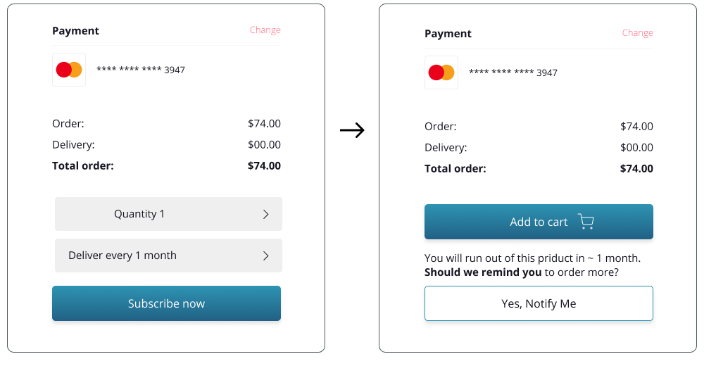
Improved follow through, uncertainty.
Hick’s Law More options lead to harder decisions. Color coding and priming alleviates problems made by decision making.

Improved decision making, reduce bounce rate.
Banner blindness – Users have learned to ignore content that resembles ads, is close to ads, or appears in locations traditionally dedicated to ads. By adjusting location and information provided to users we increase the chance of desired action.

Improved experience, reduced actions
Pressing Gmail button will automatically be redirected to email location, reducing confusion and time it takes to find confirmation email.

Improved choice, added personalization
By adding additional step, we give users a chance to confirm their decision and alleviate stress. By adding smart question, we prime behavior and build trust

Improved feedback, User experience
color coding and breadcrumbs help with stress of making mistake, adding additional question helps with uncertainty and privacy concerns.

Improved follow through, decision making, reduce bounce rate.
Chunking People remember grouped information better.
Confirmation Bias People look for evidence that confirms what they think.
Clear information and control help client with decision making and future concerns, leading to follow through.

Process & Working environment

.png)


